Experimental Typography
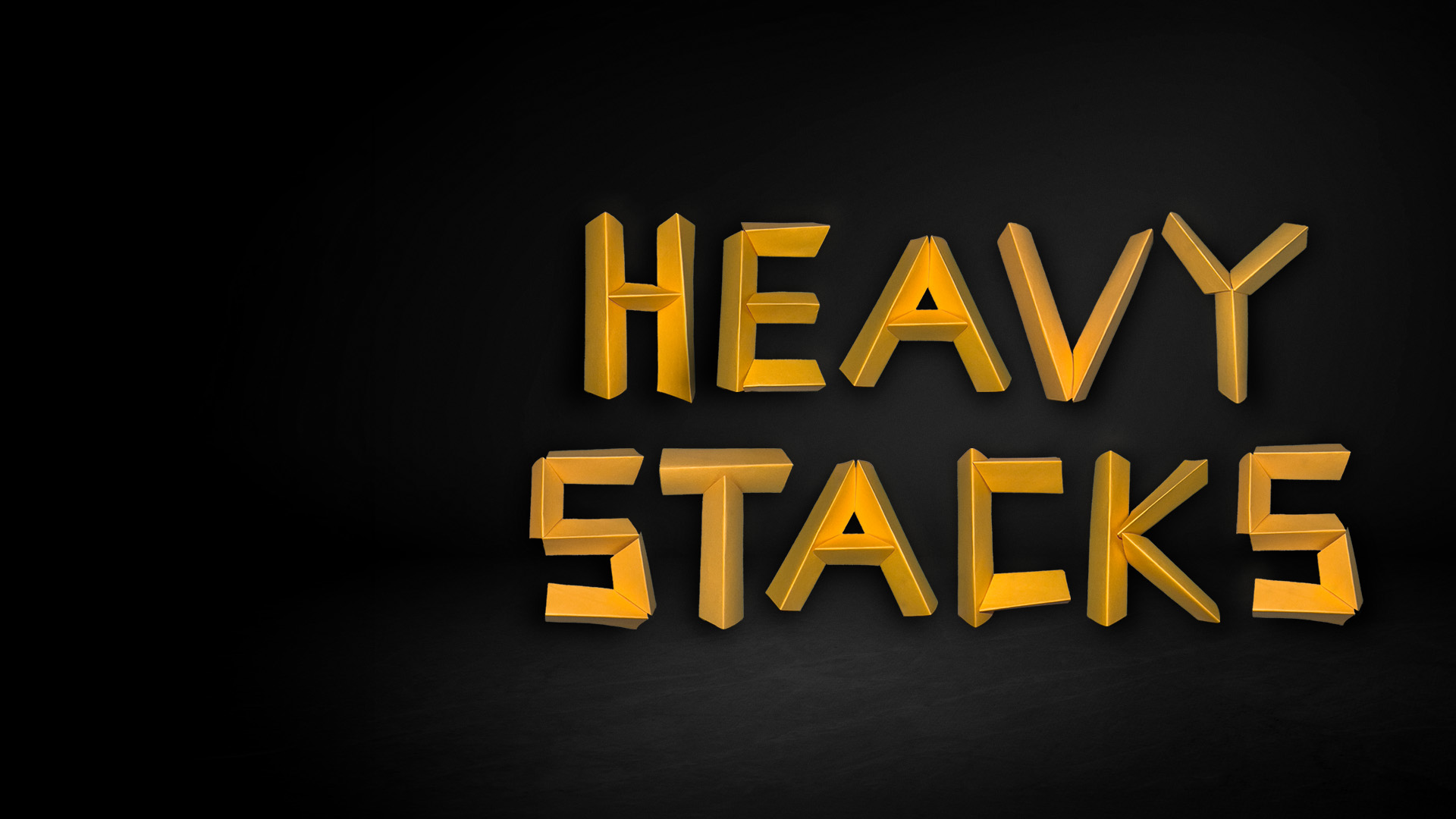
Heavy Stacks
Paper to Metal
An experimental typeface that turns ordinary sticky notes into bold, sculptural letterforms through folding, cutting, lighting, and photographic manipulation.
The Challenge
Typography off the screen
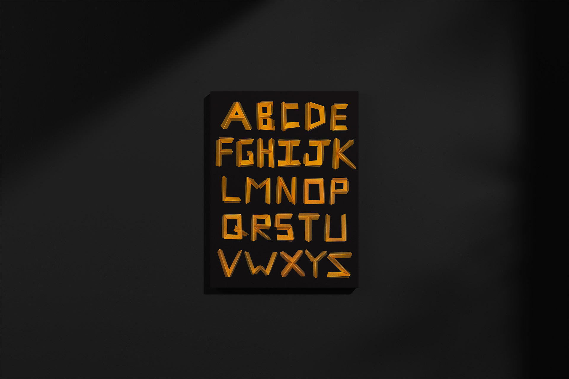
Type design usually lives on a screen. Heavy Stacks set out to do the opposite, building letterforms by hand from the most ordinary material available: sticky notes. The goal was to move typography into something tactile and sculptural, and to see what depth, contrast, and weight could come out of folding and cutting paper. The result is a complete A-to-Z typeface, in capitals and lowercase, built entirely from paper.
The Process
From sticky note to sculptural type
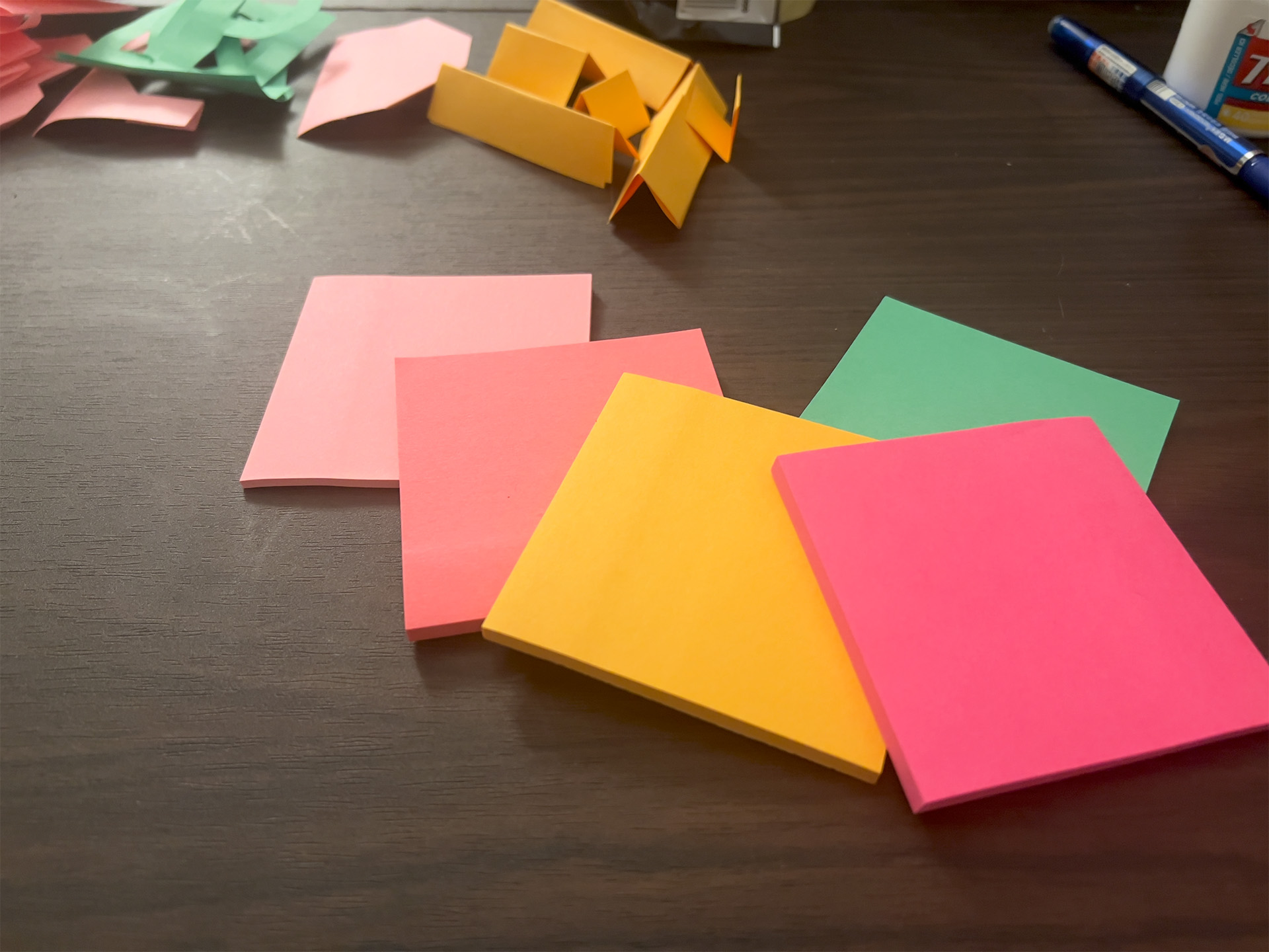
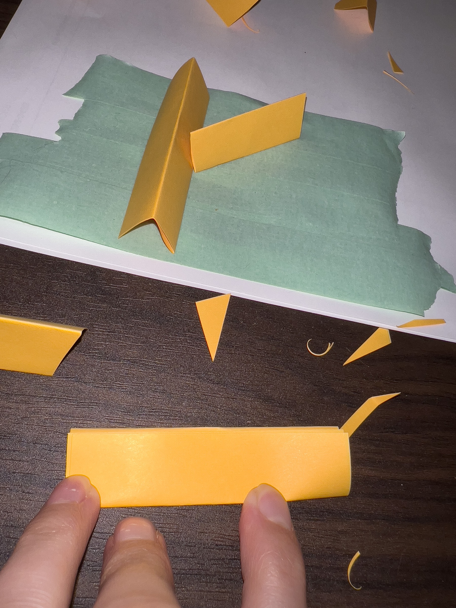
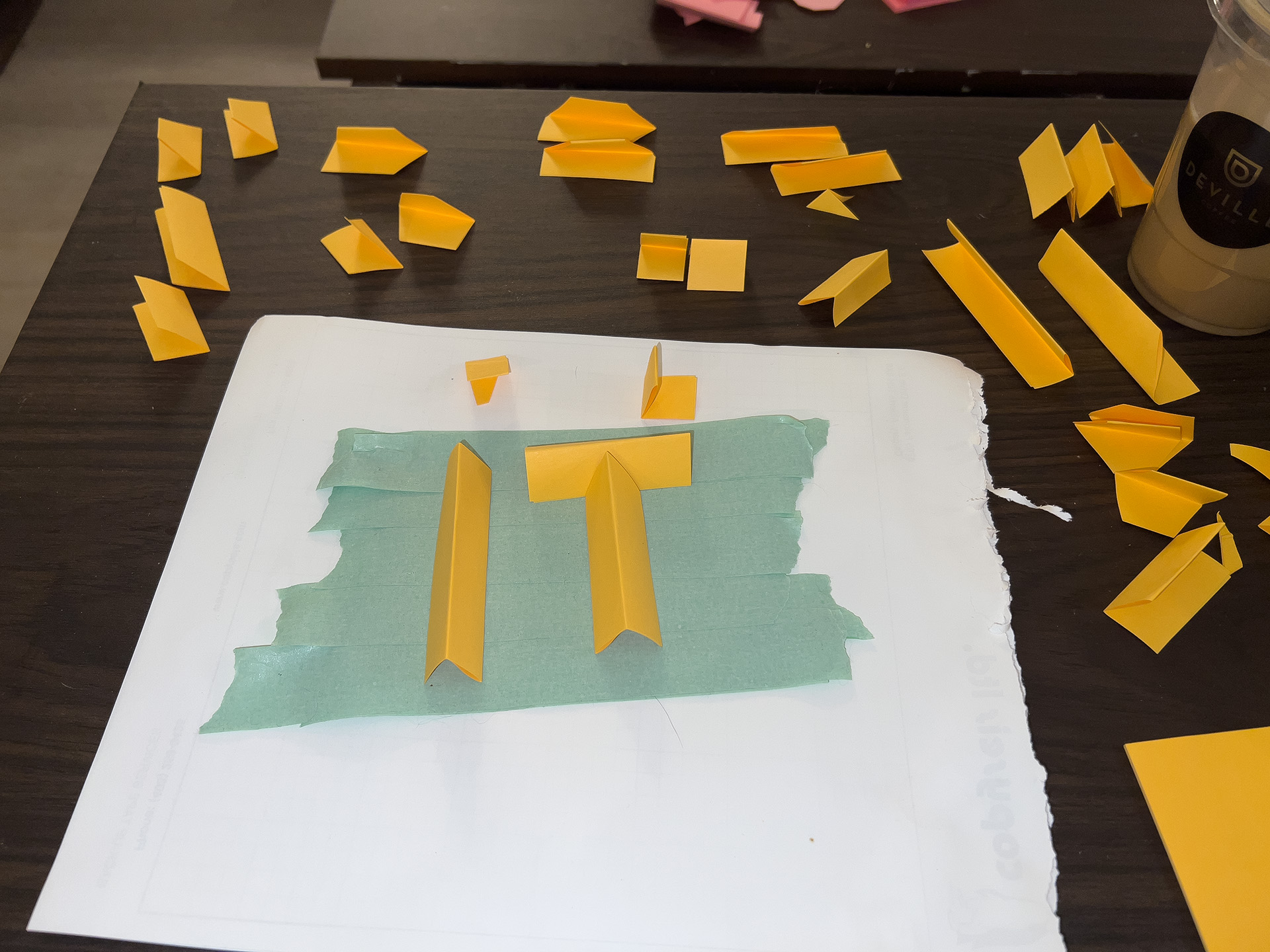
The experiment started with nothing but sticky notes, scissors, and tape, using the tape only to hold letters in place rather than to bind them. Each note was folded in half twice: the first fold stuck the note to itself, and the second created the crisp edges you see in the final letters.
The corners and connections never sat quite right, so I trimmed the edges on an angle so the pieces would meet more cleanly. Because the paper kept unfolding and shifting as I assembled each letter, perfect alignment was impossible, and that slight imperfection ended up adding to the final look.
I photographed the letters at night, lit with a nearby lamp and a flashlight, which threw dramatic contrast across every fold. I leaned into that, pushing the contrast further in Lightroom and Photoshop, then cut each letter out, removing the shadows and background so the forms could stand on their own.
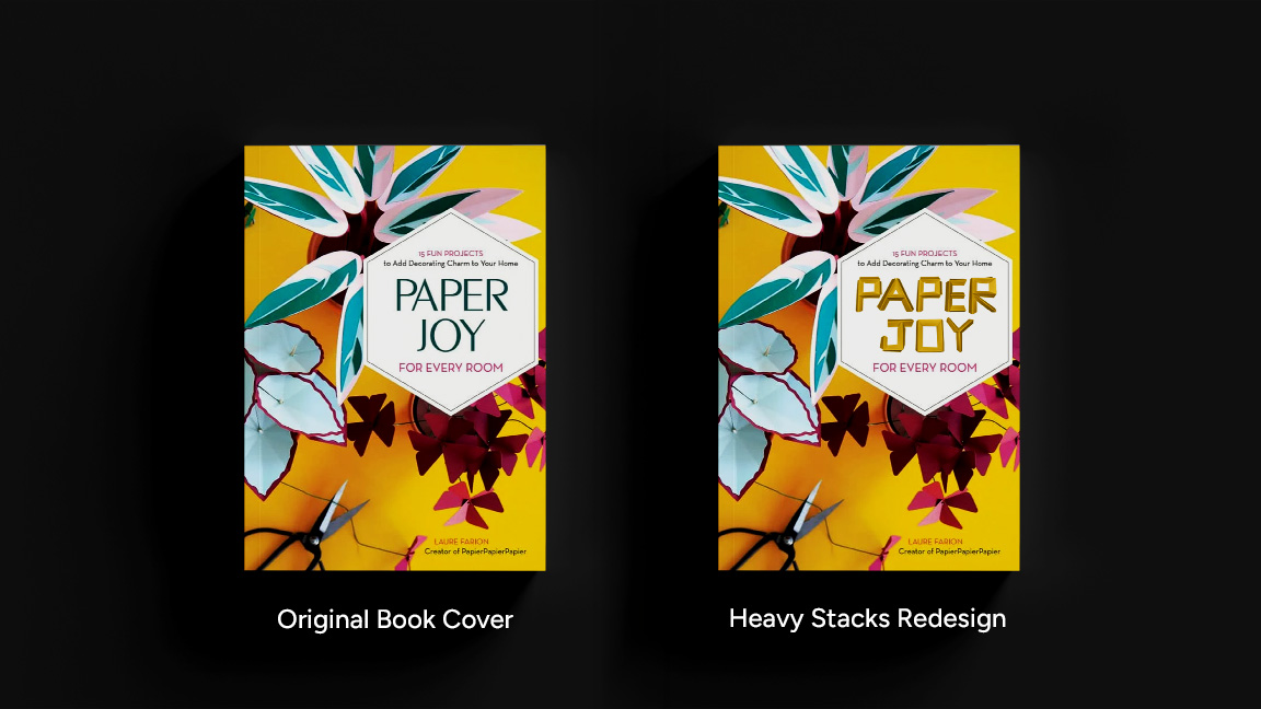
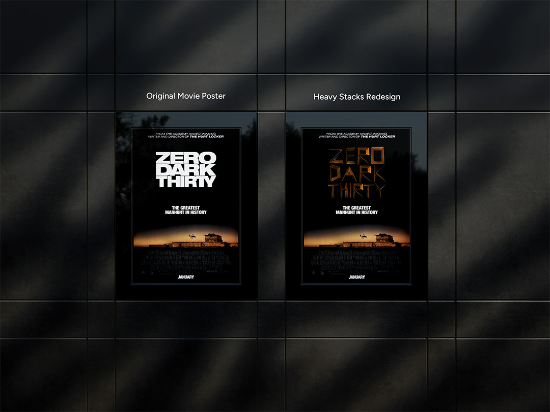
Application
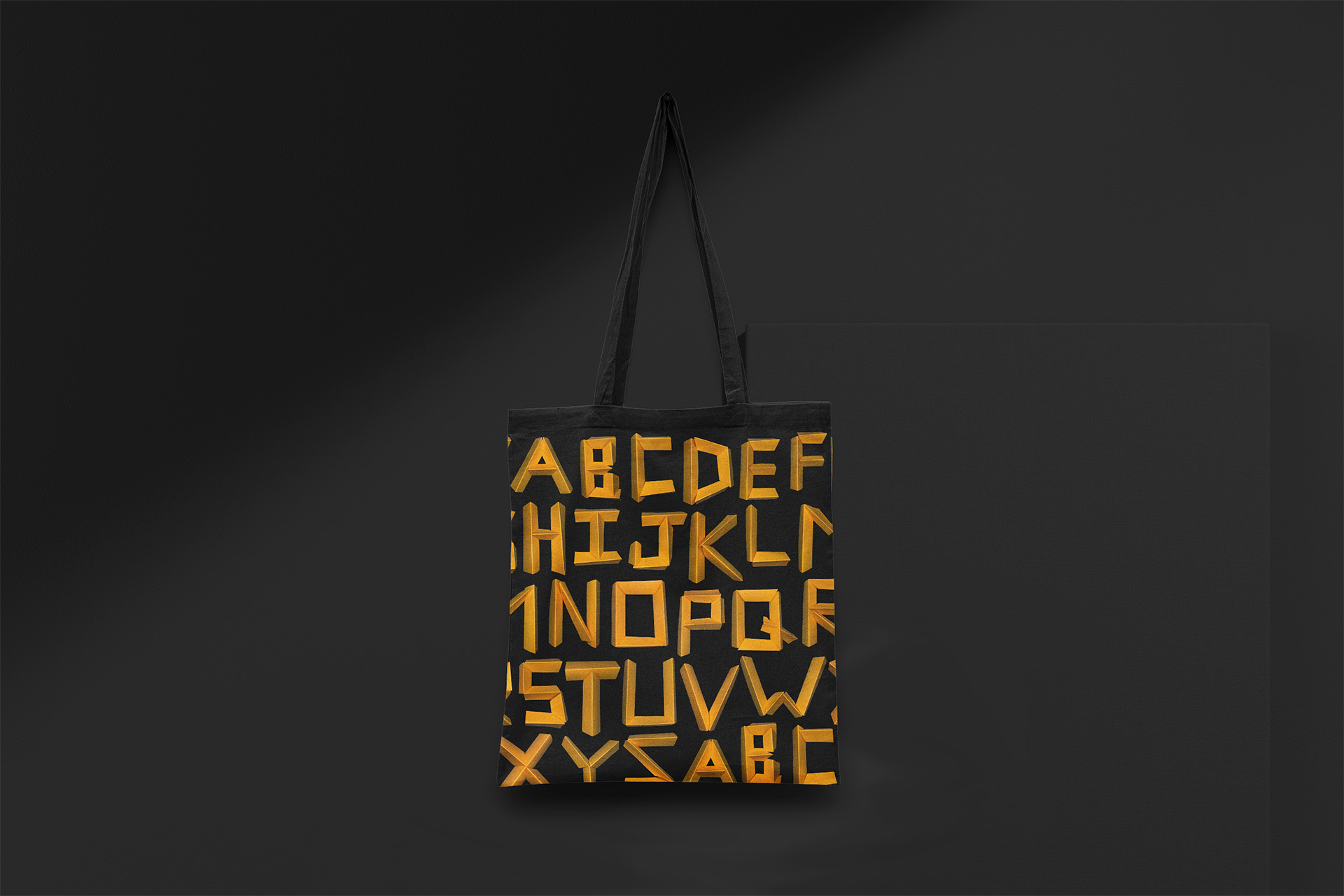
Type in the real world
The final stage tested how the typeface could work in real design: posters, covers, and bold compositions that push the letters beyond pure experiment. Their heavy, sculptural presence makes Heavy Stacks especially suited to display and editorial use, where impact matters more than fine text.
Reflection
What I'm most proud of
I'm proudest of how ironic it turned out. Starting from something as lightweight and disposable as a sticky note and ending with type that reads as dense, solid, and almost metallic is exactly the contrast the name Heavy Stacks is built on. The project is really about perception and material illusion, and the letters earn that illusion entirely by hand.