Marketing Campaign
Between Tides
A Support Kit for Creative Waves
A human-centred brand campaign that supports creative students and early-career designers through creative block, using grounding visuals and reassuring messaging.
The Challenge
Support that doesn't add pressure
Creative block carries real emotional weight: overwhelm, avoidance, and anxiety. Yet most tools aimed at it push productivity, stimulation, or motivation, which only adds pressure during an already difficult moment. Between Tides was designed in response to that. Rather than framing creative block as failure, it treats it as a natural, recurring part of the creative process that deserves a calmer kind of support.
The Approach
Human-centred, grounded, and deliberately offline
This project was a practice in human-centred design. Brainstorming and research narrowed the focus from broad burnout down to creative block specifically. The solution became a physical support kit rather than an app, because a tangible object is grounding in itself and can sit on a desk or in a creative space as a calm, low-tech reminder. An app was considered and set aside in favour of reducing screen time and keeping the experience physical.
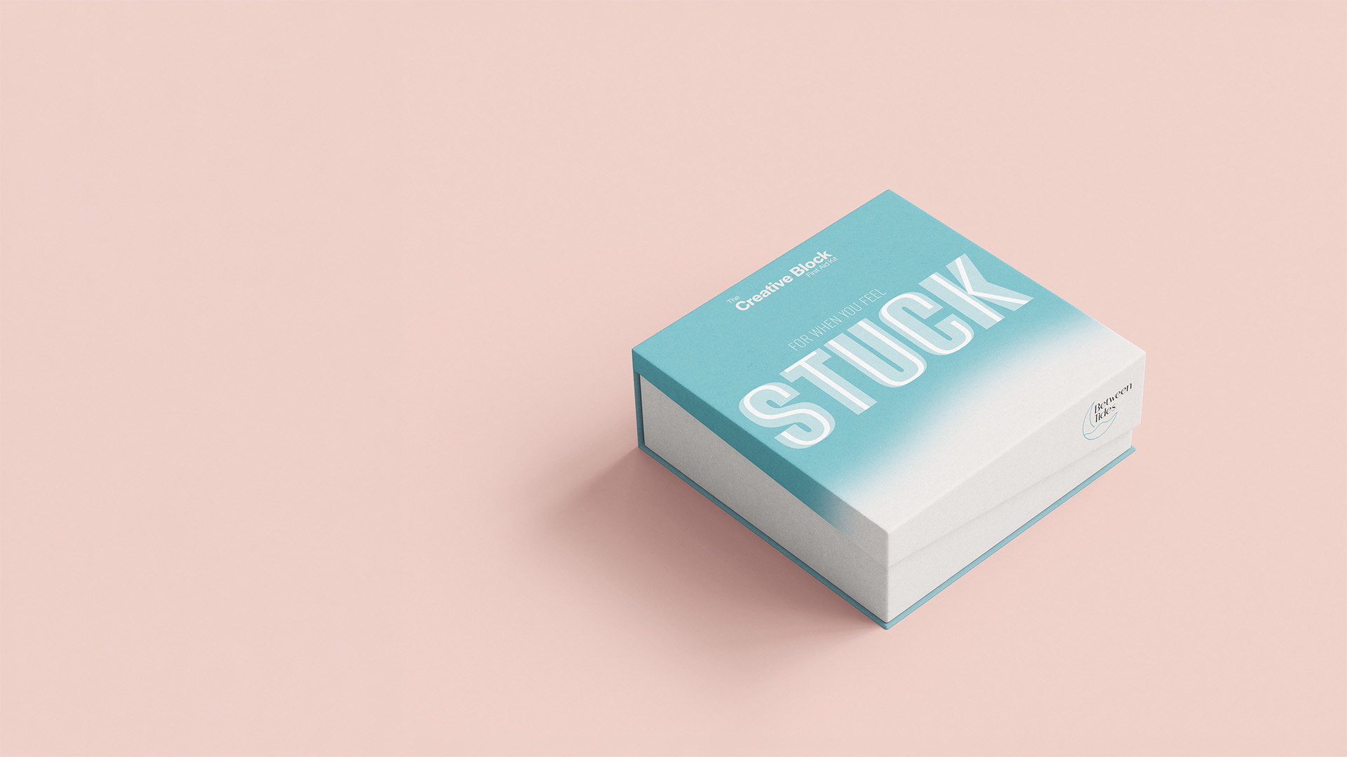
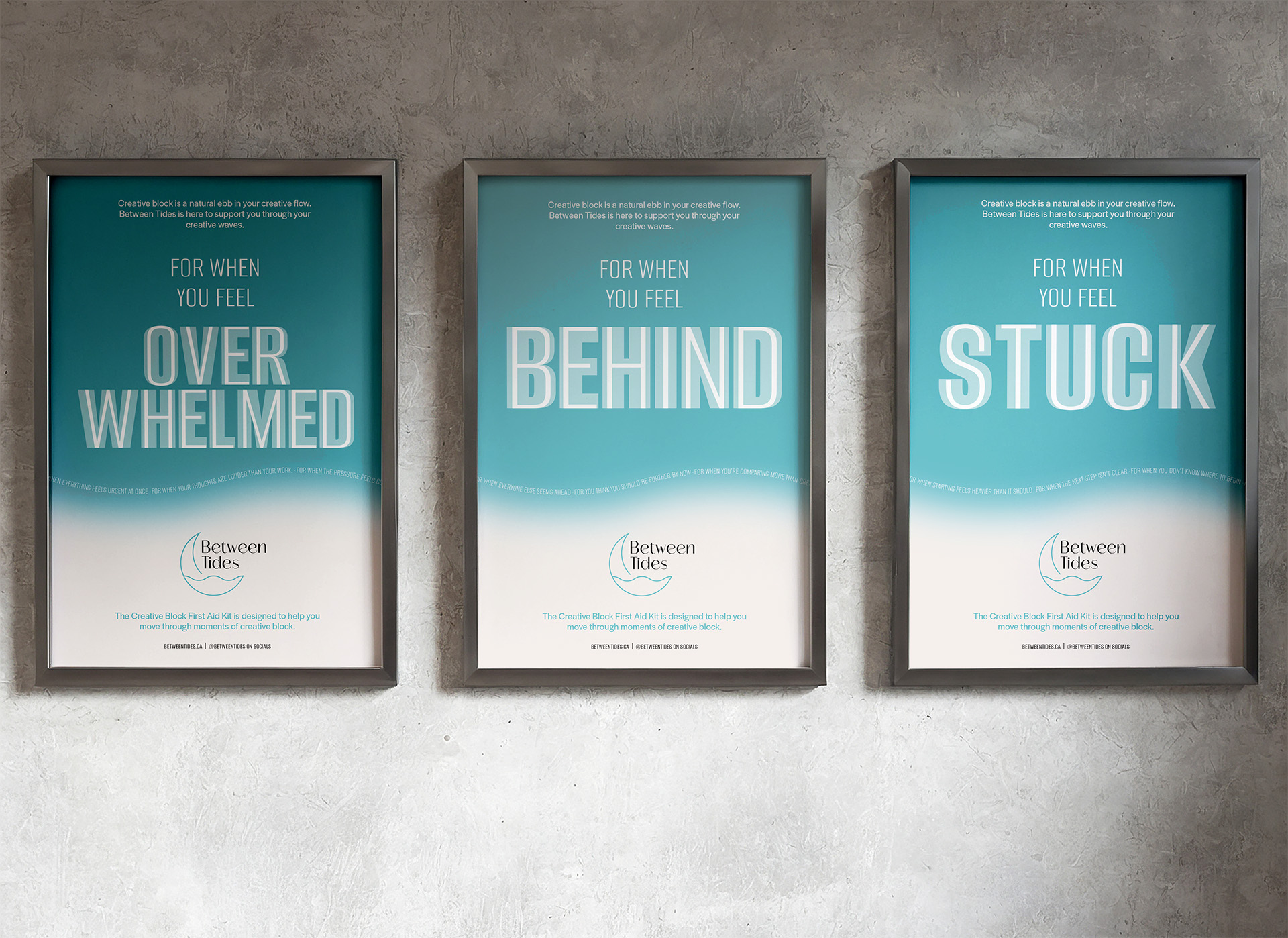
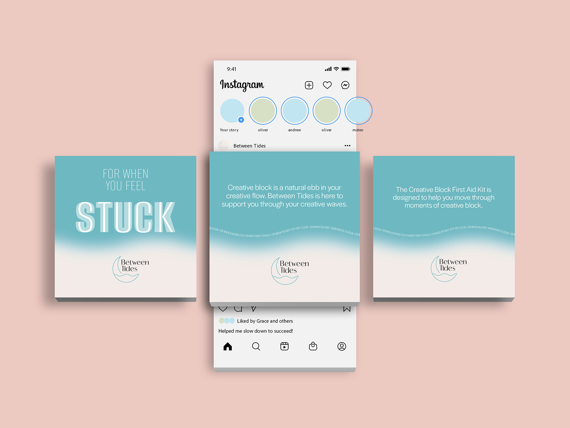
The Creative Block First Aid Kit borrows the familiar form of a first aid kit, reframed for stress and creative block. The visual identity draws on flowing rivers and lapping waves: blue as a calming colour, soft gradients, subtle wave textures, and a wave-like type element. From there it extends into a campaign of posters, Instagram posts, bookmarks, and an interactive sticky-note wall, each built to create a moment of pause rather than push for output.
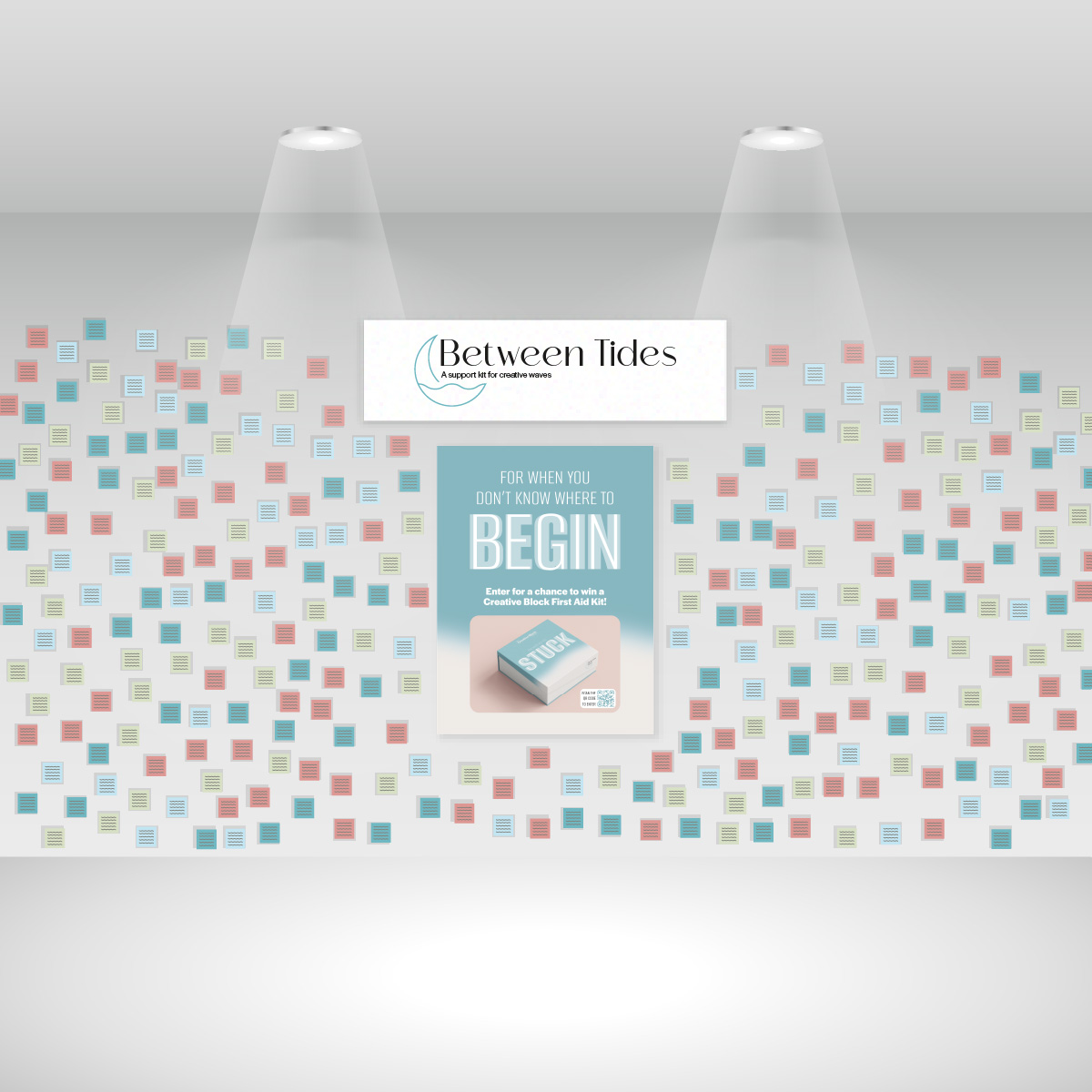
Interactive Wall
A collective record of the creative pause
The sticky-note wall was inspired by Subway Therapy, the public sticky-note installation, and adapted into a participatory brand moment for spaces where creative people already gather. Visitors write how creative block feels, how they experience it, or what helps them move through it, building a shared, visible record that says the struggle is normal.
Participation links to a giveaway for the Creative Block First Aid Kit through a QR code, turning a quiet act of reflection into a direct, memorable way to meet the brand.
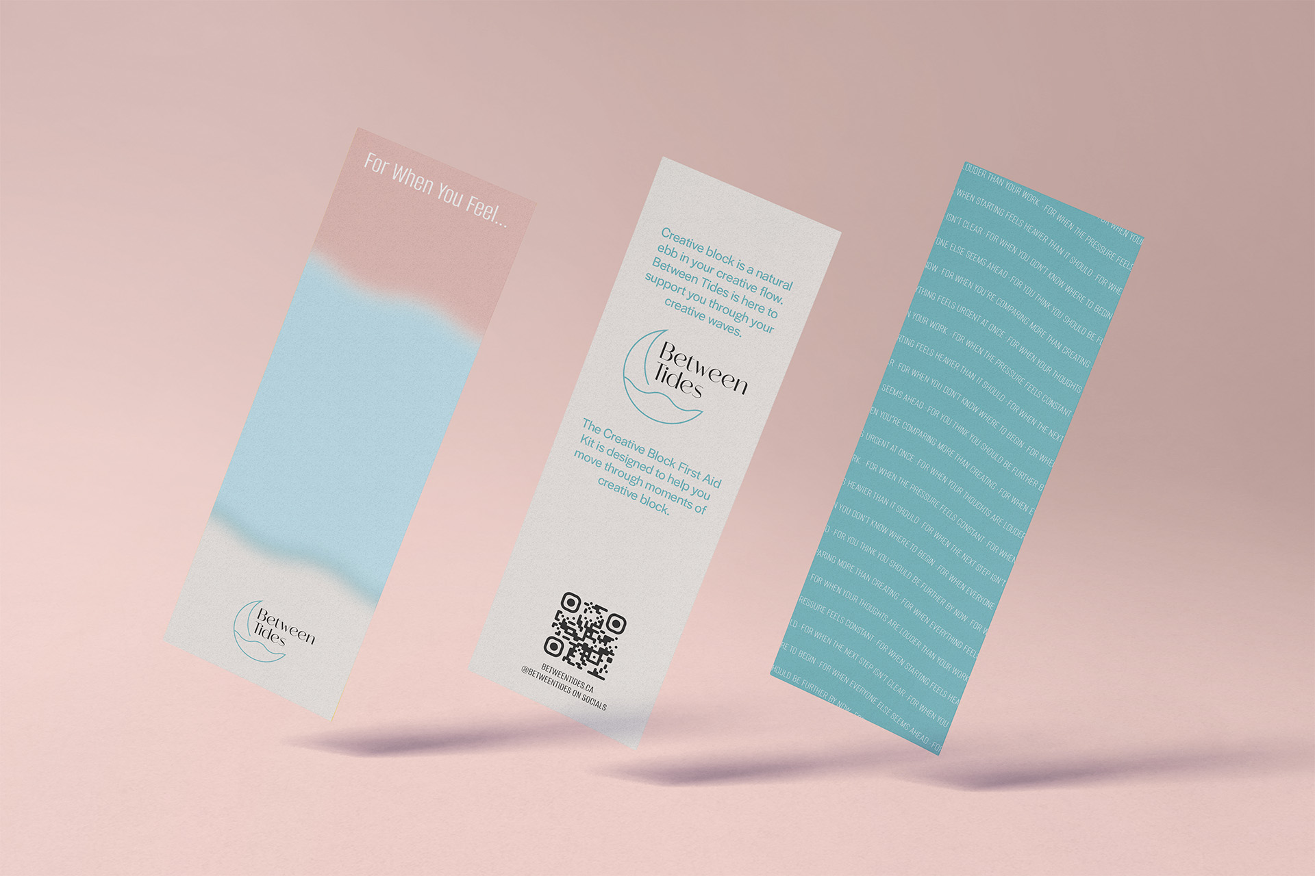
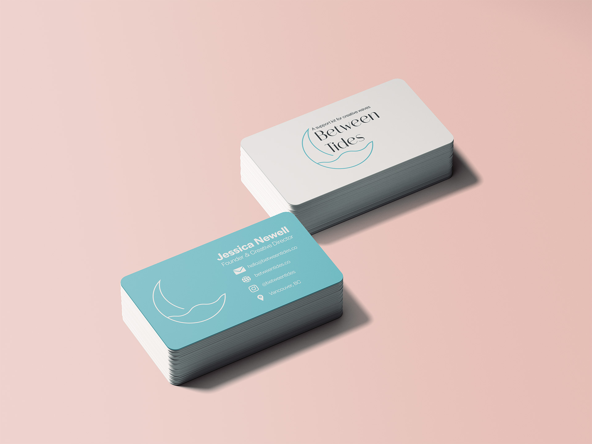
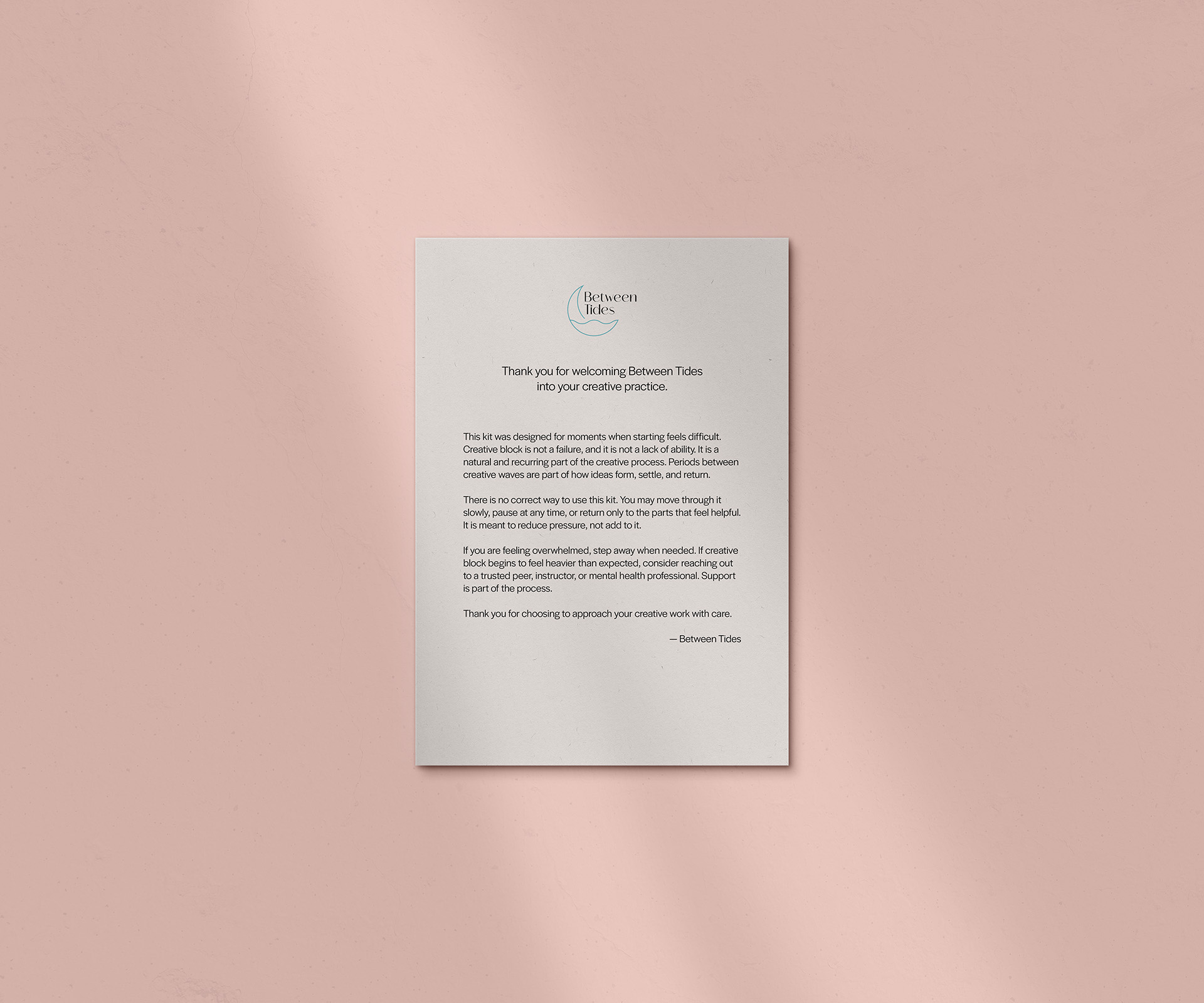
Printed Touchpoints
The brand in small moments
Bookmarks, business cards, and a thank-you kit insert carry Between Tides into everyday and event settings. Each one uses calm, front-facing imagery and simple information, extending the brand voice into the small moments around the kit and reinforcing the idea that creative block is something to move through with care.
Reflection
What I'm most proud of
I loved how the posters turned the concept into a strong visual statement, and I found the whole human-centred process genuinely engaging, from research through iteration, always thinking about users and how they would respond. The piece I am proudest of is the sticky-note wall: it is a direct, engaging way to involve the public and bring the campaign to life beyond the screen.